The family: Nigel, David and Nellie, the cat. The house: An 1880s, semi-detached house in Ealing, west London. ‘It’s described as Edwardian baroque because it has lots of architectural decorative plaster, more commonly seen in public buildings than domestic homes,’ says Nigel.
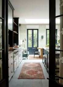
A childhood spent growing up in Australia had imbued Nigel Hunt with a love of open-plan, lateral living spaces, something that he and partner David were keen to replicate when they moved into their Edwardian home in Ealing three years ago. The property’s proportions were a great starting point for the aesthetic the couple were after – three-metre-high ceilings and huge French doors leading into a lush garden. Thanks to Nigel’s job as marketing director of Sanderson Design Group, creative ideas weren’t short on the ground. Nor was this the first Neptune kitchen they’d developed together, having discovered Neptune some 14 years previously when admiring a friend’s barn conversion kitchen in Oxfordshire.
Nigel and David had been collating moodboard images and materials for some time before they visited Neptune Chiswick to start the design process. ‘I had some strong ideas already but it was great to work with the designers to see how we could translate them into a reality,’ recalls Nigel. They opted for the Chichester kitchen because, as Nigel explains, ‘We loved the quality and the simplicity of the design but it has enough elements to add interest and integrity too.’
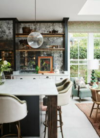
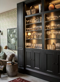
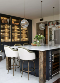
The couple were keen that the space worked as a kitchen but also as a place to entertain and to relax together at the end of the day. While they wanted a large island, they realised that putting the dining table in the usual spot between the island and facing wall would feel constricted. Instead, they located the table towards the doors and designed a glass-fronted unit using narrower wall cabinets as the base and softly backlit shelving above. The bespoke pillars on either side concealed a building support, and the shelves became a home to Nigel’s ever-growing collection of vintage glassware.
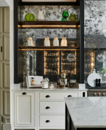
Nigel wasn’t afraid to be brave with some of his decorating decisions, especially with the expert advice of the Neptune design team to support him. The flooring is actually York stone slabs made for patios which have a textured sawn finish to them, and Nigel sourced bespoke, blackened ‘burnt’ oak shelves to sit either side of the range.
And there were yet more stand-out design decisions that led to the final look. The choice of heavily silvered, foxed glass along one wall – and even over the cooker hood – adds a hint of glamour, and carefully planned lighting means the kitchen can move easily from practical cook zone to atmospheric chill space. Even the bar stools around the island were selected to feel like comfy armchairs at a smart bistro bar.
Colour was a key factor in the look. Having already had a Neptune kitchen painted in off-black, this time they were keen to move to the lighter – though still moody – end of the palette for a more contemporary look. They selected Shell for the lower cabinets and, after a few trials, a custom dark blue-grey (our Ink or Charcoal shades would be very similar) for the upper woodwork, island and display cabinet. ‘That’s the great thing about these kitchens,’ says Nigel, ‘you can easily tweak the colours to adapt to the look you’re going for.’
Given Nigel’s job, decorative elements were always going to be part of the design. The Morris & Co. Willow Bough paper from the Ben Pentreath collection worked as a link to bring a sense of the garden inside, while a comfy armchair is covered in Zoffany’s Pomegranate fabric. ‘I love customising pieces,’ adds Nigel, ‘and with this kitchen, we’ve been able to create a well-functioning but very personal space.’







Comments